
brandguide Lienesch
visual guidance
This is a brand guide created by INC for Lienesch. This brand guide is made to help internal marketing/communication departments or external design/communication agencies visually guide the Lienesch brand.
own collections, created together
lienesch philosophy
Lienesch, specialist in the decorative, functional and technical fabrics for indoor and window treatments, was founded in 2001 by Bennie Lienesch in Haaksbergen The Netherlands. Lienesch is known for her passion for textiles that is characterized by unique and innovative collections with a natural textile feel. In collaboration with employees, customers and partners, we are able to surprise the market again and again by appropriate combinations of materials, design and technology, without forgetting who we are and what we pursue.
Since the foundation connections between employees, customers and partners were key. Because we believe that our inspiration stems from our relations and cooperation with employees, customers and partners. Ultimately it’s all about the balance between reason and feeling, between product and human.
Welcome to Lienesch.
identity lienesch
why
We believe you inspire most when appreciating the best in each other.
how
By creating own collections together.
what
Developing, creating and pleating decorative, functional and technical textile.
promise
Own collections, created together.
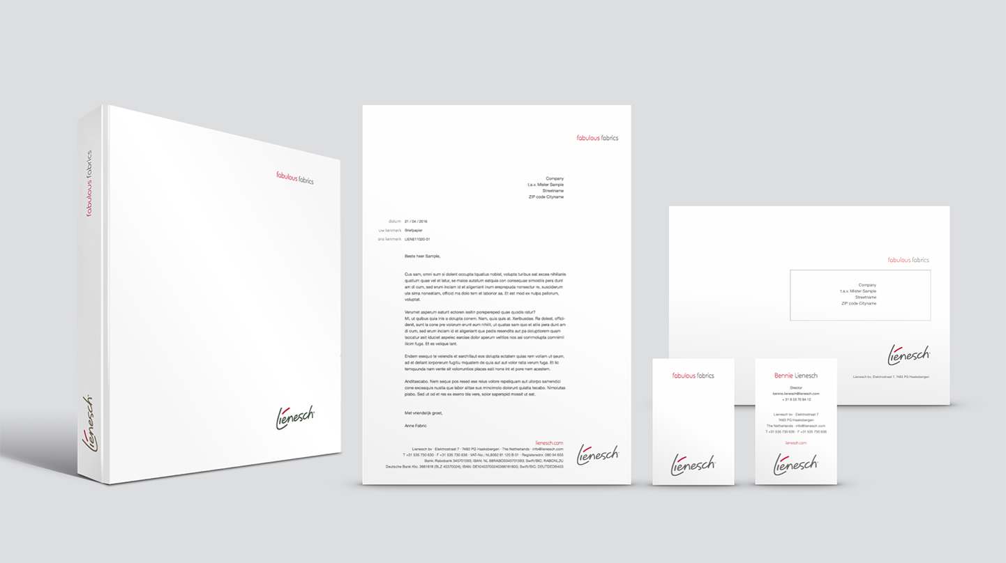
our corporate logo
The red stripe in our logo finds it’s origin in Bennie Lienesch’s signature. Our forward way of thinking, working and passion are found in the direction and colour of the stripe. It consists of two colours and is only to be used on a white background in it’s original proportions.
The position of the logo is always bottom right, make sure the alignment as shown below is maintained. A square in the bottom right corner forms the whitespace for our logo to rest upon.
Our logo is available in various extensions and colours, for various communication. We have put great care in selecting the right colour palette for a large range of variables. Please select the right colour for the right material.
When do we apply Lienesch corporate communication?
When communicating about Lienesch as a whole, we use corporate communication and the corporate Lienesch logo. Using our white colour as foundation.
Click here to download our corporate logo
When do we apply product market combination communication?
When communicating about Lienesch Home, Lienesch Move or Lienesch Form, we use communication accordingly and the logo with the right suffix. Using our white colour as foundation. Down below you will find the versions you need. Please be keen on the right use of the right logo. If you have any questions, please contact us.

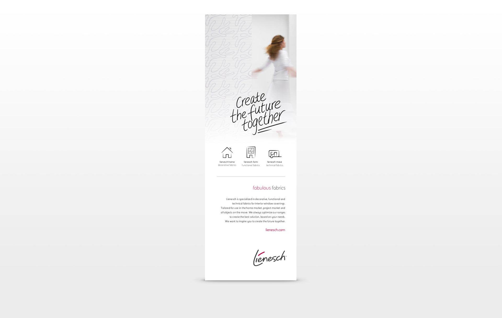
corporate pay-off
Our pay-off is the foundation of all our collections. Whatever the application, we always set out to create fabulous fabrics together. We communicate our pay-off on all our binders, our website, mail signatures and collection boxes. Cards do not need to communicate the pay-off since they already contain the fabulous fabrics.
The position of ‘fabulous fabrics’ is always in the top right corner. Make sure the alignment as shown in the images below is maintained. A square in the bottom and top right corners form the whitespace for the elements to align with. The width of our logo is the width of our pay-off.
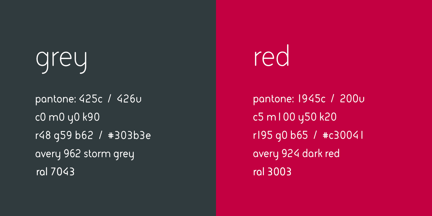
lienesch colours
We have put great care in selecting the right colour palette for a large range of variables. Please select the right colour for the right material.
• RGB is used for digital presentation
• CMYK is used for full colour print
• PMS is used for print or fleet marking
Lienesch white colour
As the blending of all colours in existence, white is the colour of wholeness and completion. Our white colour is the foundation for our fabulous fabrics to present themselves without any barriers.
web address
We always communicate one web address. Lienesch.com is the foundation for all our collections to show themselves. Our homepage will guide you quickly to the section that interests you, but also inspires with our other collections.

icons
We have a clean and consistent set of icons to explain technical specifications of our fabrics. Text can be added when needed. When applying, the size of the icons should all be equal so that line thickness of these icons are all the same.

our fonts
Our font FS Sophie is used in all our printed communication. Depending on the size used, the weight of the font varies from light to regular. Using the light version for headers and the regular version for normal text. The bold version of the font is only used to accentuate. No capitals are used in headers.
Click here to download the FS Sophie font
In more ‘formal’ and also internal communication we use Arial regular:
Mail: Arial font size 9 colour black 90% – HEX: #191919
Word: Arial font size 9 colour black 100% – HEX: #000000
Excel: Arial font size 10 colour black 100% – HEX: #000000
numbers in writing
All numbers up to twenty are one word, therefor we always communicate them as words, not as numbers. For instance: sixteen in stead of 16. This gives a more cohesive look to our communication.
All numbers above twenty can be communicated as numbers. Due to the multiple words it improves readability. For instance: 23 in stead of twenty-three
handwriting
The handwritten texts are a real handwriting, this is not a font. They are made especially for every collection. These handwritings are aligned horizontally to the right and centered vertically in layouts between our pay-off and logo, as shown on our collections.
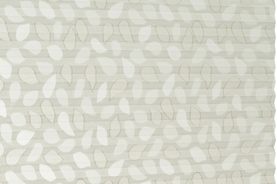
fabulous fabrics for your home
lienesch home
When communicating this collection, we always pronounce it: Lienesch Home. Fabric names in our Lienesch Home collection are based upon cities where people all over the world can find their home.
As the blending of all colours in existence, white is the colour of wholeness and completion. Our white colour is the foundation for our fabulous fabrics to present themselves without any barriers.
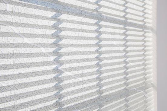
functional fabrics for the contract market
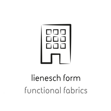
lienesch form
Form follows function
“A principle associated with modernist architecture and industrial design in the 20th century. The shape of a building or object should be primarily based upon its intended function or purpose.”
When communicating this collection, we always pronounce it: Lienesch Form. Fabric names in our Lienesch Form collection are based upon the architectural jargon.
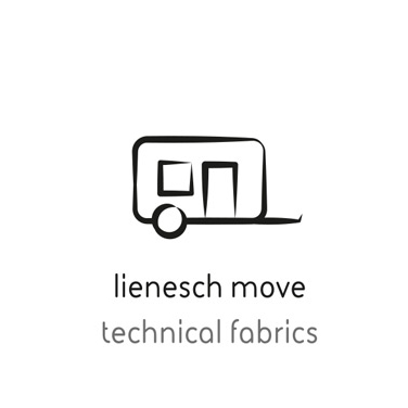
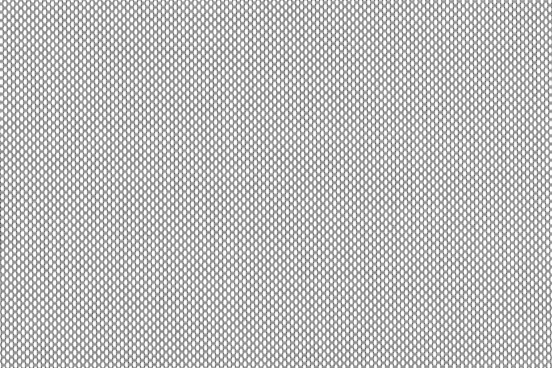
technical fabrics, optimized for mobility
lienesch move
Fitting the best needs for planes, trains, cars, caravans and all objects that move. This collection is still under construction.
In this collection the specific function of the fabrics and materials is key. Apart from mosquito gauze and black-out fabrics, the collection includes a series of space dividers. The articles are perfect for the application in for example caravans and boats.
Click here to download the Lienesch Move logo
our markets
When communicating about the markets in which we operate, we describe the fabrics on which we focus the most for these markets. Click here to download the illustration of our markets.
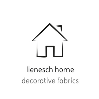
lienesch home
decorative fabrics
lienesch form
functional fabrics
lienesch home
technical fabrics
corporate photography
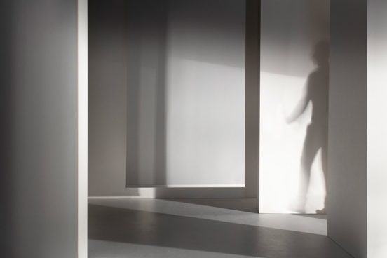
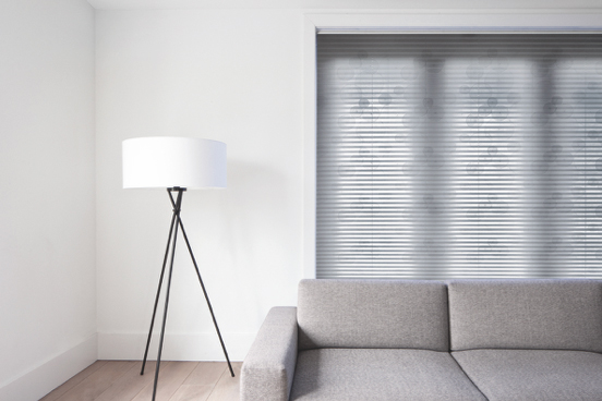
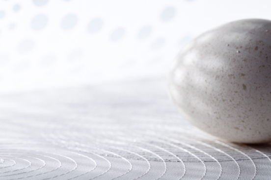
The corporate photography of Lienesch has a distinctive visual language. No realistic interiors, but abstract settings, with subtle references and textile as the hero.
Lienesch uses 8 types of photography:
1. interior Lienesch
a. inspiration b. conversion
2. interior cardservice
3. mood
4. closeup
5. repeat
6. fabric scans
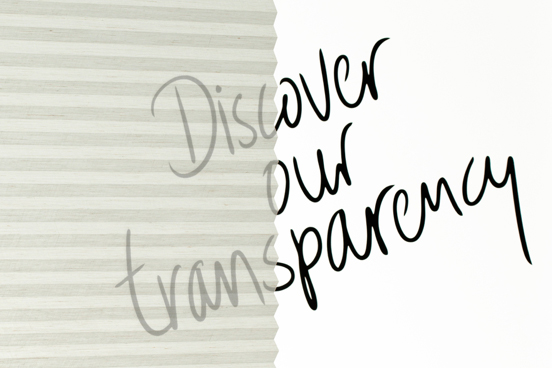
7. transparency
8. Lienesch hero's
photography guidelines
To ensure that Lienesch’s visual language is consistent, we use photography guidelines. Download the complete photography guideline here.
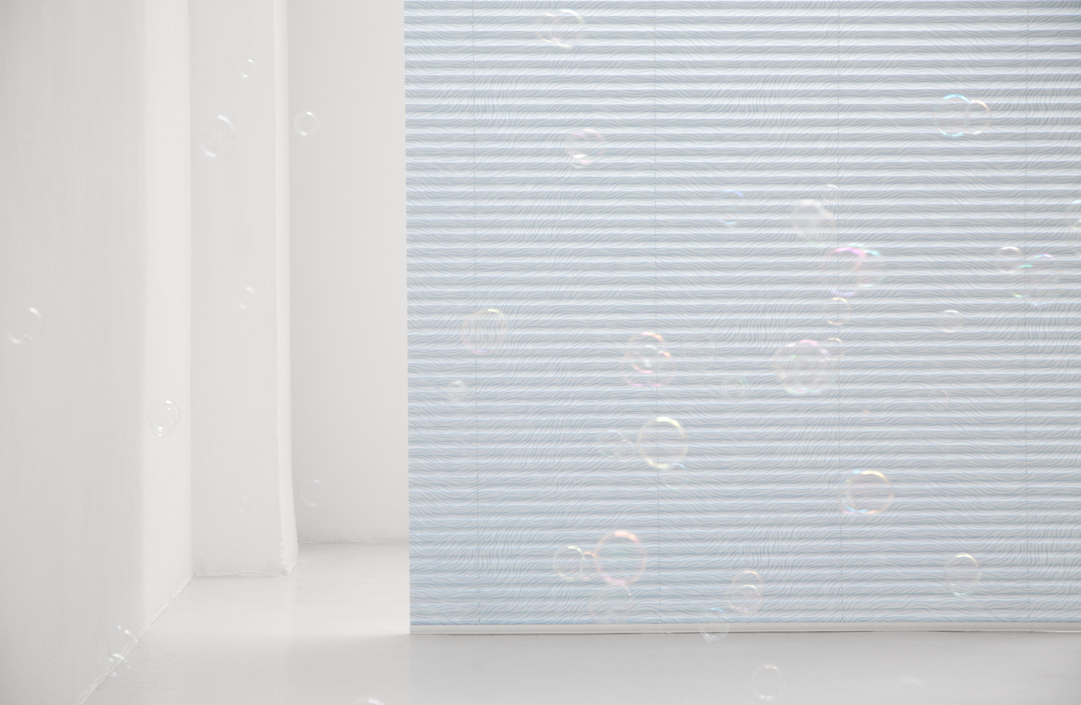
Textile is the hero
Textile is our hero. The textile is not mounted in a window, but in front of it or freely in the room.
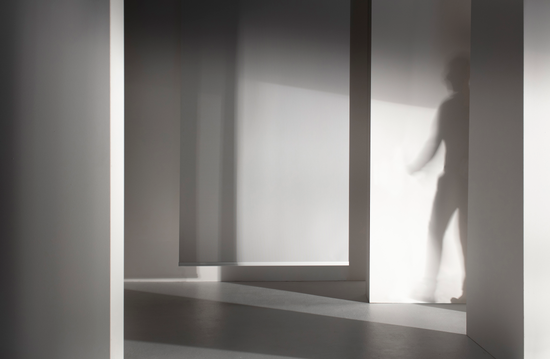
Dynamics: human presence
The image feels dynamic, due to the suggestion of a human presence
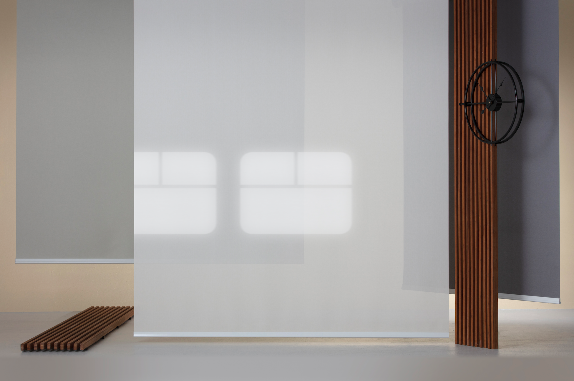
Abstraction
The images contain abstraction levels by applying for instance: movement, alienation, light and shadow effect.
corporate advertising
When communicating for the corporate Lienesch brand, we use these elements:
- tell what we do: create the future together
- show the markets in which we operate
- explain what type of fabric we focus on in these markets
- show our pay off
- tell our story
- show our corporate weblink
- communicate our corporate logo
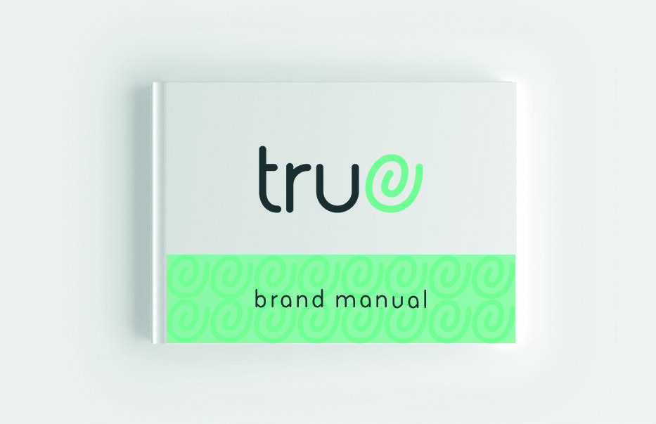
true® fabrics
True® is a fair and transparent label for window decoration fabrics and is only applied when we are sure that it meets all the sustainability criteria. Fabrics labelled with the True® logo, are genuine, sustainable fabrics. Products with this label are real products. Made with fair, traceable materials and honest manufacturing processes. And most of the time, they are made from post-consumer recycled polyester. With which we make a real contribution to the future of our planet and its inhabitants.
Because together, we decide the future and create fabrics that matter. Sustainable and unique fabrics. True® fabrics.
True® is a registered trademark of Lienesch b.v. and may be used by customers (and their customers) who have signed the True® licensing agreement with Lienesch.
Want to become a True® license partner? Contact us at info@true-textile.com or visit true-textile.com for more information about our True® fabrics.
questions
If you have any questions or additions, we’d love to hear from you. Please contact us by calling +31 535 730630 or send us an email: together@lienesch.com